Right Here, Right Now: Interactive Installations @ RMIT

Over the past three semesters I’ve had the pleasure of co-steering a studio elective with Caroline Vains, for Interior Design students within the school of Architecture and Design at RMIT. Loosely – we’ve been exploring the intersection of video projection, built objects and interior design.

Most interior design students are already highly visually literate, great at quickly visualising their ideas in many ways, and unlike most video oriented people I know – are fantastic at working with materials and constructing models. As well as adapting very quickly to the world of projected video, they also bring along considerable materials testing, research and construction skills.

This semester though, we added interactivity as a requirement. In addition to learning video editing, video composition, animation, and projection mapping – they needed to think about how they would include some simple lo-fi interactivity in their projects. It’s quite satisfying to report that they responded wonderfully to that challenge, and I’m happy to share some of those efforts below.

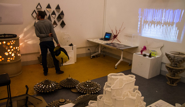
Right Here, Right Now (Sem 2, 2013 – elective studio with Caroline Vains and Sean Healy – Interior Design, RMIT.)

(Course Document  (PDF) and readings / 12 weeks of related blog posts).

0jimmy-nick-david

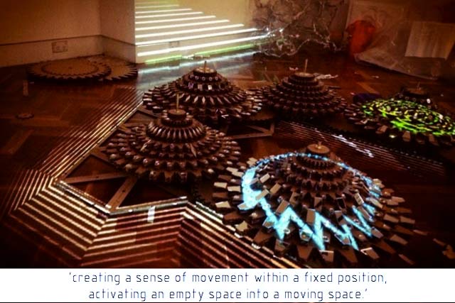
Pictured above –  the crowd-pleasing bicycle powered installation by Jimmy Liu, David Dai and Nick Hsu. (‘Team Brothers!’ ). A series of reflective gears were connected to pedals and a bicycle seat, causing the carefully mapped projections to reflect around the space. This was a nice evolution from their earlier experiments which included tight geometric mapping sequences, and three dimensional arrangements of laser-cut paint splashes.

Part of the pleasure with this studio – is seeing how different skills and ideas merge, and evolve, over time. For example, Hexin Bi used his experience from scuba diving as the inspiration for his audiovisual installation, rigorously analysing the rhythm of his underwater breath…

1hexin


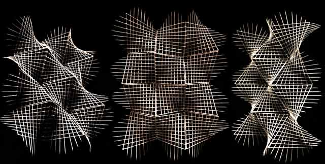
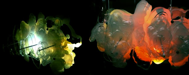
.. while Jacinta Birchmore explored repetitive forms and texture, beginning with the intricate model below, before iterating through other shapes and surfaces.

2jay

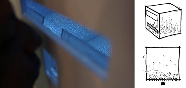
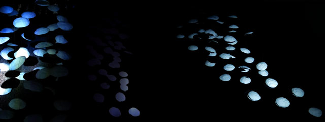
Together for their final piece – they continued to explore scuba diving, but took it in a new direction, creating a breath activated installation. Their structure featured a layer of styrofoam balls which obscured the projector light from shining through, unless someone blows through the mouthpiece – which scatters the balls and enables the animation to bounce around inside their mirrored space (a process accentuated by a breath-powered spinning reflector ).  Guest blower: Ramesh Ayyar.

3hexin-jay-ramesh

Tisha Sara Dewi, Jing Yang and Ranqi Liu created a beautifully made cone structure, to be viewed from underneath:

6tisha-jing-ranqi

Michael Kuo and Ting Jiang played with precision modelling, mapping and hand activated rotations:

7michael-ting

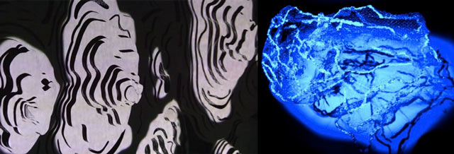
Another blending of approaches: Stacy Rich’s topographies and Danielle Bird’s organic textural work..

4stacy-danielle

.. later combined to produce a quite beautiful structure (which unfortunately had a few interactive / mechanical problems).

5stacy-danielle2

Tahlia Landrigan produced an intricate response to the music of Nicholas Jaar…

8tahlia

and Fenella McGowan’s structure built from cotton buds responded to projection beautifully, as did Nikita Demetriou’s tissue-paper hangings…

8a-fenella-nikita

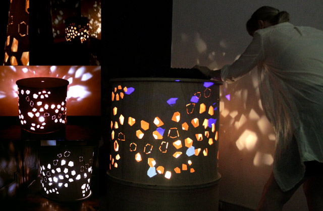
Together that trio diligently combined their efforts to produce a wooden bicycle work – which featured a pair of revolving wooden cylinders, each with precision cut holes, and a bicycle wheel on top for spinning the cylinders, altering the light patterns being emitted from within.

9nikitafenella-tahlia

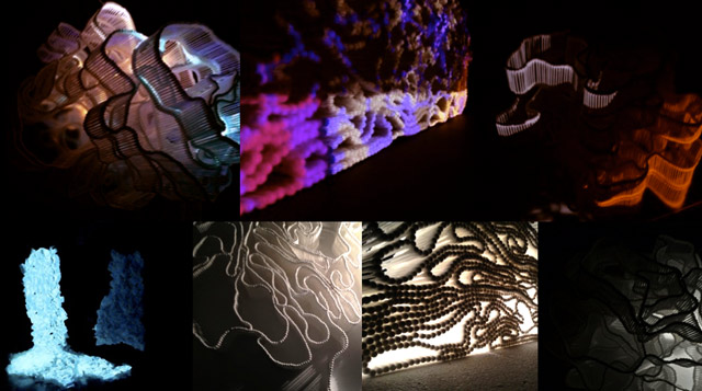
Aside from the prowess with construction, another trait interior design students seem to share – is a flair for dynamic documentation, very comfortably playing with formats and materials to best express their projects. Below, a couple of examples by Stacy + Jimmy.

documentation

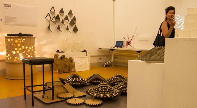
Below, the projects grouped as part of the final exhibition … (note the bicycle pedals for activating the ‘Team Brothers’ piece at the top of the page).

exhibition_02

And finally, studio co-ordinator Caroline, wondering where the semester has gone to…

exhibition_01


Thanks to Caroline and the entire studio for a great semester!

by j p, November 18, 2013 0 comments

DARK MOFO 2013, Festival of Light in Hobart

dark-mofo-collage

Let There be Light..

Winter in Tasmania isn’t an obvious time and place for a festival, but MONA isn’t your average museum / gallery. And so began in 2013, MONA’s DARK MOFO (Jun 13-23), an annual festival that riffs on the idea of winter solstice with pagan celebrations of light ( + art, fires, lasers,  feasting, etc..). This included:  the Red Queen exhibition  @ MONA,/ performative chefs, Skywhale (a sculptural / sky-breasted hot air balloon by Patricia Piccini), Robin Fox laser performances, and a whole host of other light and projection related artworks…

Oh, You Mean *LIGHT*..

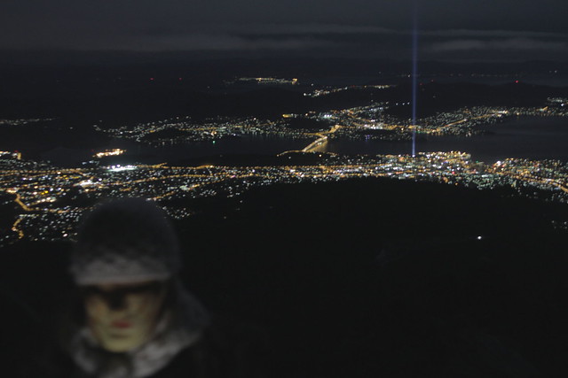
… All of which were made irrelevant by Ryoji Ikeda‘s 5KM HIGH BEAM OF LIGHT INTO THE SKY ( aka ‘Spectra‘).

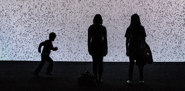
Simultaneously over at the gallery, Ryoji exhibited his Datamatics work. Really enjoyed this more than expected. It’s a very well documented and promoted work, but none of that captures the oddly calming oceanic presence it has.

Elsewhere, Batgirl battles Ryoji in animated GIF format.

Claustrophobic, Stroboscopic, Light…

The Beam in Thine Own Eye exhibition gathered together a range of works exploring the limits of perception. Zee by Kurt Hentschlager was the most spectacular of these, an intensely stroboscopic smoke filled room, that came with pages of warnings, had medical staff on standby, and completely blurred the capacity to distinguish between what was happening in front of or behind your eyes. There’s a great interview with Kurt here. Other standouts:

Ivana Franke – “We Close Our Eyes and See A Flock of Birds” -A cyclinder shaped room, with central seating, facing out against LED covered curved walls, which proceed to strobe and flash their way through a range of sequences.

Anish Kapoor – “Imagined Monochrome” – An artwork experienced one at a time – because it involved laying down and having your *eyeballs* massaged by a professional eyeball masseuse. I missed getting an appointment for this, but apparently it was fantastic.

.. And Dark (Faux Mo).

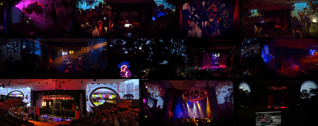
DARK FAUX MO, the festival club –  is what I was there for – projection mapping a disused double-storey theatre space each night. Performers included Miles Brown, Super Wild Horses, ZOND, My Disco, Zanzibar Chanel, Mixmasters ( who cooked soup + dumplings on stage while they DJ-ed some tracks), Andee Frost, Rainbow Connection DJs and more. It was a wild space, delightfully decorated, with lots of roving performers – so it came up great in photos. (Eg collage at the top of this post – or see flickr photo set)

 Previously:

MONA FOMA 2013, the summer edition.. held in a Hobart laneway, where I projection mapped animations onto a 4 storey fire escape (painted white).

by j p, November 7, 2013 0 comments

Visual Composition with Quartz Composer

QC_3Dcompositing_640

“There’s a lot of wonderful possibilities for real-time visual compositing with Quartz Composer. Most existing QC learning resources though, tend to emphasise the generative graphics capabilities of QC. For those with a post-production, animation, motion graphics or VJ background – QC’s composition potential can be difficult to unleash.”

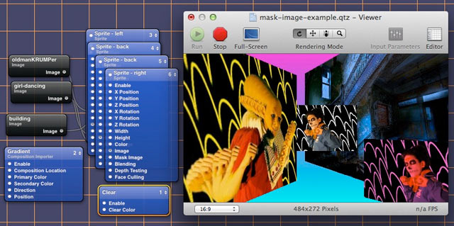
Hoping to make the transition to Quartz Composer a bit easier for the above kinda folk – I’ve gone and made a page  which documents how various animation + post production techniques and processes can be recreated inside QC…

(eg Composite multiple video sources, Image Masking, Pre-framing video into compositions, Working With Layers from Photoshop, Nesting + Pre-composing in AE, Inverse Kinematics, camera paths.. etc).

I’m planning to slowly add to this ‘Compositing with Quartz Composer‘ page over time.. with the hope that it’ll  –

  • help non-programmers with video compositing ideas, adapt to QC more easily
  • help me wrap my head around QC better (the page features many questions…)
  • encourage more experimentation with visual composition effects in QC (alongside the current popularity of using QC to generate graphics)

Would love to hear from anyone with questions (about something that isn’t clear) – or suggestions ( how to clarify a concept better, or other animation concepts that could be included etc ).


by j p, October 14, 2013 0 comments

Book Review: Learning Quartz Composer

Learning Quartz Composer: A Hands-on Guide to Creating Motion Graphics with Quartz Composer

ILQCbook

“Whether you dream of live visuals, interactive installations, Cocoa apps, dashboard widgets, or extra awesomeness for your film and motion graphics projects, Quartz Composer will enable you to develop beautiful solutions in amazingly short periods of time…”

“….To make up for all the gaps in video tutorials and forum posts scattered around the interwebs we wrote a book…”

– Graham Robinson (aka Shakinda) + Surya Buchwald (aka Momo the Monster)

A Quartz Composer book has been long desired by the real-time video community, given the combination of its unique capabilities and severely undercooked documentation online. Hats off to Graham and Surya for rising to that challenge, and helping expose QC’s potential for visual artists of many flavours.

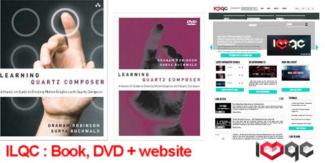
These days a book inevitably also means an accompanying DVD of video tutorials (which can also be accessed online by those who buy the PDF, book code needed), and an extended support website (ILoveQC).

Who Should Read This Book?

According to the authors – Maker types /Motion graphics designers, film makers, VJs, artists, interactive programmers, and Cocoa developers. If that’s you – this book will help – “…even the unsophisticated user into creating art projects, visuals for a band or party, wild Preface screensavers, and RSS-powered trade-show kiosks. For anyone with a programming background, the material quickly opens up a new world of visual potential”.

Who shouldn’t? “Advanced Quartz Composer users looking for detailed knowledge about using GLSL and OpenCL, or creating your own plugins in Objective-C..”

How’d that work out for me?

To give some context of my QC understanding – previously I’d been asked by Graham to write a few words about how I use Quartz Composer and VDMX:

“Coming from a non-programming background, I’ve found some of the concepts and structural logic of Quartz hard to grasp, and the engineerish manual doesn’t help much. Kineme.net and the QC mailing list – seem helpful, but also populated by mostly advanced discussions – which tends to stifle introductory questions and beginner problems. So I found myself trying to learn QC by forcing myself to explain what I was learning about it as I explored it.”

This scattered learning approach lead me to writing up these QC tutorials…

Part 1 (Intro and overview of resources available)
Part 2 (Making a split-screen effect)
Part 3: DIY Anchor Rotation FX for VDMX
Part 4: 3D Objects With Video Textures in VDMX
Part 5: Using Twitter Hashtags + RSS feeds in VDMX (now outdated since Twitter changed its RSS feed mechanism.. )

What I found myself really craving was a learning resource that broke down the structural logic of QC, and which explained some of the principles in ways that related to how I wanted to use it as a compositing tool. And this, the ILQC book mostly delivered – using deliberately plain and simple language, and making no presumptions about animation or programming knowledge. A quick glance over their contents page, gives an idea of the book’s scope:

  • What is Quartz Composer and Why Should I Learn it?
  • The Interface and Playing a Movie
  • Adding Visual Effects
  • Using LFOs, Interpolation and Trackballs to Move Stuff
  • Debugging
  • Particles
  • Mouse Input
  • MIDI Interfacing (Getting Sliders and Knobs Involved)
  • Interacting with Audio
  • Lighting and Timelines
  • Replication / Iteration
  • Modelling Complex Environments ( 3D Cities )
  • Create a Cocoa App
  • Create a Screensaver
  • Secret Patches, Core Filters, and GLSL

(‘glance inside‘ / book preview at amazon )

And?

– The examples are well chosen, and build up on skill levels as the book progresses
– The book examples and video tutorials correspond really nicely to see each other
– There’s a good emphasis on concrete examples, while explaining the principles that make it possible
– That said, found myself wanting some more explanations of underlying concepts occasionally
– Gaps? Would’ve liked some more advanced exploration of:

  • how ‘timelines’ and ‘queues’ can be utilised within patches
  • ‘structure’ and ‘multiplex’ related patches
  • ‘render in image’ and ‘rendering’
  • the composition process in QC, explained relative to composition software such as After Effects… giving a bit more of an explanation of how the overall 2D / 3D possibilities work, and how they could be utilised / explored in many directions..

This book fills a great gap in learning resources for Quartz Composer.. so hopefully rumours of QC’s gradual demise stay that way, and some of the recent flourishing of QC activity ( as an interactive prototyper / and as discussed on the very active Quartz Composer Facebook group ) continues on.

by j p, September 24, 2013 0 comments

Creation Cinema @ Melbourne Museum

creation1-640x360

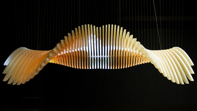
Ok, ENESS – you had me at ‘projection mapped kinetic sculpture’. The Creation Cinema  – seen above, is now installed at the Melbourne Museum as part of First Peoples, an exhibition celebrating ‘the history, culture, achievements and survival of Victoria’s Aboriginal people.’ It’s a gorgeous installation, located inside a circular room, which is in turn enclosed by intricate layers of wood. Once inside – the sublime smoothness and grace of motion immediately captivates. It’s something that animators strive for with onscreen movements, but is so much more satisfying to witness with moving physical parts. Within that darkened egg of a room, the sounds, video and slow relentless movements of the wing fragments all add up to quite sublime effect. Fantastic installation, and viewable for the next 10 years!

Other projects by ENESSA Tilt of Light (cleverly adapting a seesaw), an interactive skate-ramp for the TRON sequel.

by j p, September 23, 2013 0 comments